The Art of Data Reduction: How PCA Makes Sense of Large Datasets
The world around us may seem random and unpredictable, but even in chaos, patterns tend to emerge. This is also true for large datasets. Principal Component Analysis (PCA) is a powerful tool that can help us uncover these hidden patterns.
If you’ve been following my previous articles, you’re likely familiar with the power of Singular Value Decomposition (SVD). We’ve explored its versatility in various applications, from dimensionality reduction to extracting valuable insights from complex datasets. As a cornerstone of data-driven techniques, SVD has proven indispensable in the realms of machine learning and data science, enabling tasks such as pattern recognition and classification with remarkable efficacy.
Find my previous articles on Singular Value Decomposition and its Applications.
However, our journey into data exploration doesn’t end here. Today, we’re embarking on a deeper exploration into Principal Component Analysis (PCA). Whether you’re immersed in the intricacies of fluid dynamics or captivated by the possibilities of machine learning, PCA holds a special allure. In the realm of fluid dynamics, it’s often recognized under the more familiar guise of Proper Orthogonal Decomposition (POD).
So, without delay, let’s delve into the transformative world of PCA!
PCA : Overview
Principal Component Analysis (PCA) stands as a pivotal application of Singular Value Decomposition (SVD), offering a data-driven and hierarchical perspective on high-dimensional correlated datasets. Unpacking this statement reveals a wealth of insights. Firstly, PCA relies on SVD as its fundamental framework, underlining its inherently data-centric nature. Secondly, the hierarchical representation it provides involves extracting dominant patterns from complex datasets and arranging them in order of significance, with SVD serving as a facilitator in this process. Lastly, the term “correlated dataset” warrants further exploration.
In statistical terms, correlations serve as a vital tool for establishing relationships between variables within a dataset or even across multiple datasets. Specifically within the context of SVD and eigenvalue decomposition, correlations typically arise within a single dataset. If you’re already acquainted with Singular Value Decomposition, you’ll likely recognize the following matrices:

These are known as the correlation matrices. In linear algebra, these matrices hold a special significance. Let’s consider a matrix A with dimensions m×n. While it could be a square matrix, in many real-world scenarios, it’s often rectangular, taking the form of a tall-skinny matrix, as depicted below:
Regardless of its size, the correlation matrices derived from A will exhibit symmetry, squareness, and positive semi-definiteness (eigenvalues ≥ 0). Additionally, both matrices will share the same positive eigenvalues and rank as A, earning them the moniker “covariance matrix.” In Singular Value Decomposition (SVD), the eigenvectors of $AA^T$ are represented by U, and those of $A^T A$ by V. In the context of SVD, we refer to them as singular values. These matrices’ positive eigenvalues, the square roots of which are singular values, remain identical.
Returning to the topic of correlation matrices, we encounter two primary types: row-wise and column-wise. The matrix $AA^T$ represents the row-wise correlation matrix, computed by taking the inner product of A’s rows. Conversely, $A^T A$ signifies the column-wise correlation matrix, derived from the inner product of A’s columns. Let’s visualize these matrices to grasp the scale of correlations we’re about to handle.


Comparing the sizes of these matrices, let’s consider a time-series dataset represented by matrix A. Here, columns denote “Snapshots,” while rows encapsulate the data flattened into individual columns. Consequently, A takes on dimensions m×n, rendering $AA^T$ as m×m and $A^T A$ as n×n.
Constructing the row-wise correlation matrix $AA^T$, especially for large m, proves impractical in many applications due to its considerable dimensions and associated computational challenges. For instance, in fluid dynamics simulations or experiments with a million degrees of freedom at each time instance (where m=1 million), $AA^T$ would comprise one trillion elements. While techniques like snapshot methods can mitigate this, they’re beyond our current scope. Hence, in practice, we often compute the eigenvalue decomposition of $A^T A$, which is more manageable in size.
This matrix, $A^TA$, encapsulates the correlation pivotal to Principal Component Analysis (PCA) discussions.
PCA : The Math
Let’s embark on our exploration using the tall-skinny matrix A, which represents a time-series dataset. Our journey begins with computing the row-wise mean, effectively averaging each row of A:
\[\overline{a_{j}} = \frac{1}{m} \sum_{i=1}^m A_{ij}\]This operation yields the mean matrix:
Subsequently, we derive a mean-subtracted matrix (B) by subtracting the mean matrix from A:
\[B = A - \overline{A}\]Utilizing this Mean-subtracted matrix B, we construct a correlation matrix C using column-wise correlation:
\[C = \frac{1}{m-1} B^T B\]Now, let’s delve into two approaches for identifying principal components. Firstly, by employing the mean-subtracted matrix B, one can ascertain principal components through its Singular Value Decomposition (SVD):
\[B = USV^T\]In this scenario, the first principal component emerges as:
\[u_1 = U_{(0,0)}S_0V^T_{(0,0)}\]Alternatively, we can obtain principal components from the correlation matrix C by computing its eigenvalue decomposition:
\[CV = VD\]Here, V represents the eigenvectors, and D signifies the eigenvalues of C.
Lets consider some example to better understand PCA.
Example : Multivariate Gaussian Distribution
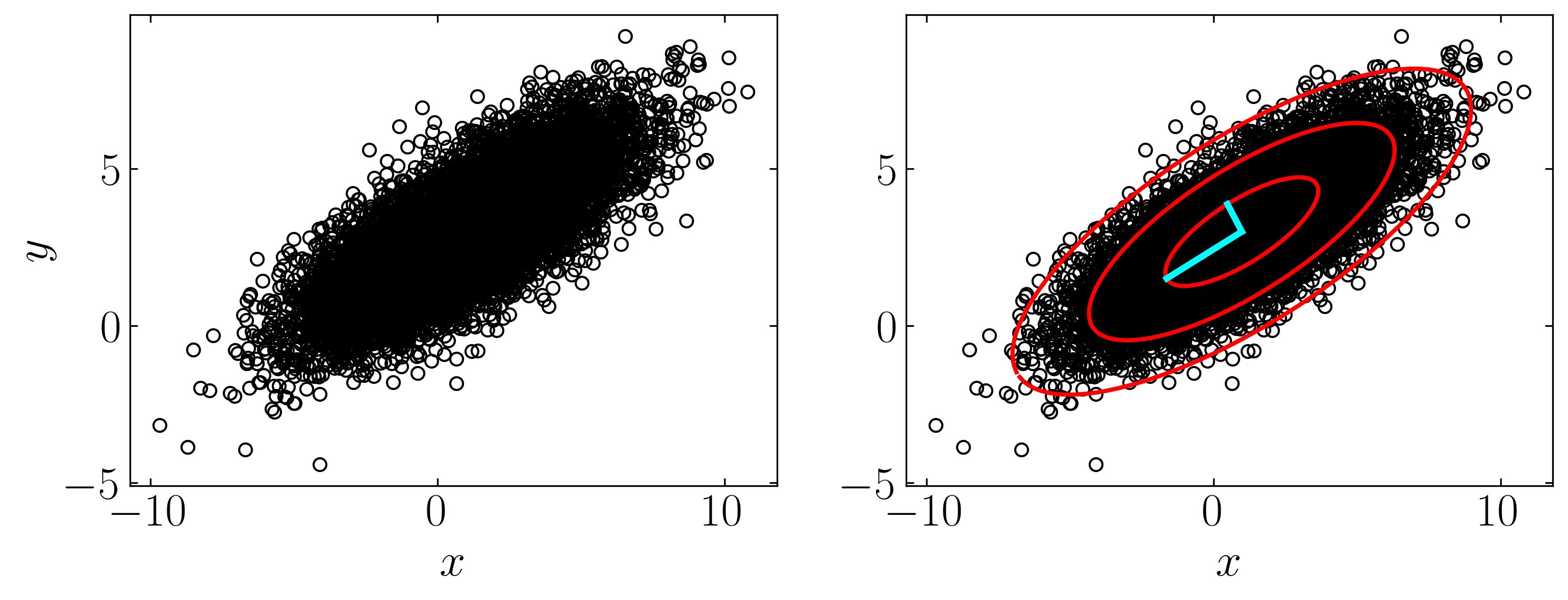
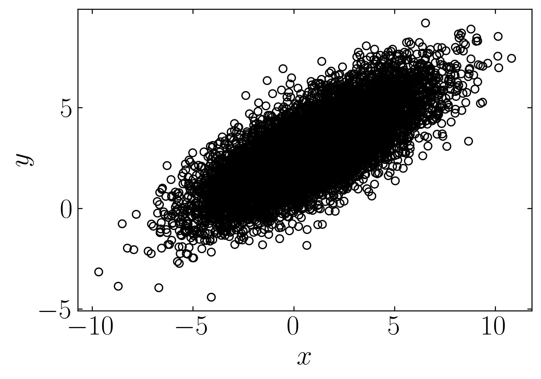
Let’s explore a simple example of a multivariate Gaussian distribution, akin to the dataset showcased on the Wikipedia page for PCA. We’ll generate this dataset comprising 10,000 data points drawn from a two-dimensional normal distribution centered at (1, 3) with standard deviations of (3, 1) along the x and y directions, respectively. Subsequently, we’ll rotate this cloud of data points by π/6 radians.
Firstly, let’s generate the dataset, and then we’ll delve into the various analyses facilitated by PCA. To follow along, fire up a Jupyter notebook and import the necessary dependencies.
### Import necessary modules

import numpy as np
import matplotlib.pyplot as plt
from matplotlib import colors
plt.rcParams.update({'font.size' : 22, 'font.family' : 'Times New Roman', "text.usetex": True})
Generate the data set,
xC = np.array([1, 3])      # Center of data (mean)
sig = np.array([3, 1])   # Principal axes
theta = np.pi/6           # Rotate cloud by pi/3

R = np.array([[np.cos(theta), -np.sin(theta)],     # Rotation matrix
              [np.sin(theta), np.cos(theta)]])

nPoints = 10000            # Create 10,000 points

### Data
X = R @ np.diag(sig) @ np.random.randn(2,nPoints) + np.diag(xC) @ np.ones((2,nPoints))
Plot using matplotlib,
fig, ax = plt.subplots()

ax.plot(X[0,:], X[1,:], marker = 'o', ls='', markerfacecolor = 'none', markeredgecolor='k', label = 'Data')

ax.set_xlabel(r'$x$')
ax.set_ylabel(r'$y$')
ax.xaxis.set_tick_params(direction='in', which='both')
ax.yaxis.set_tick_params(direction='in', which='both')
ax.xaxis.set_ticks_position('both')
ax.yaxis.set_ticks_position('both')
ax.set_aspect('equal')

plt.show()
Now, let’s utilize this dataset to perform Principal Component Analysis (PCA) and extract the first three principal components along with their confidence intervals. We’ll begin by constructing the mean-subtracted matrix and then proceed with a straightforward eigenvalue decomposition. Follow the script below to execute this task:
Xavg = np.mean(X,axis=1)                  # Compute mean
B = X - np.tile(Xavg,(nPoints,1)).T       # Mean-subtracted data

# Find principal components (SVD)
U, S, VT = np.linalg.svd(B/np.sqrt(nPoints),full_matrices=0)
Then find the first confidence interval by,
theta = 2 * np.pi * np.arange(0,1,0.01)

# 1-std confidence interval
Xstd = U @ np.diag(S) @ np.array([np.cos(theta),np.sin(theta)])
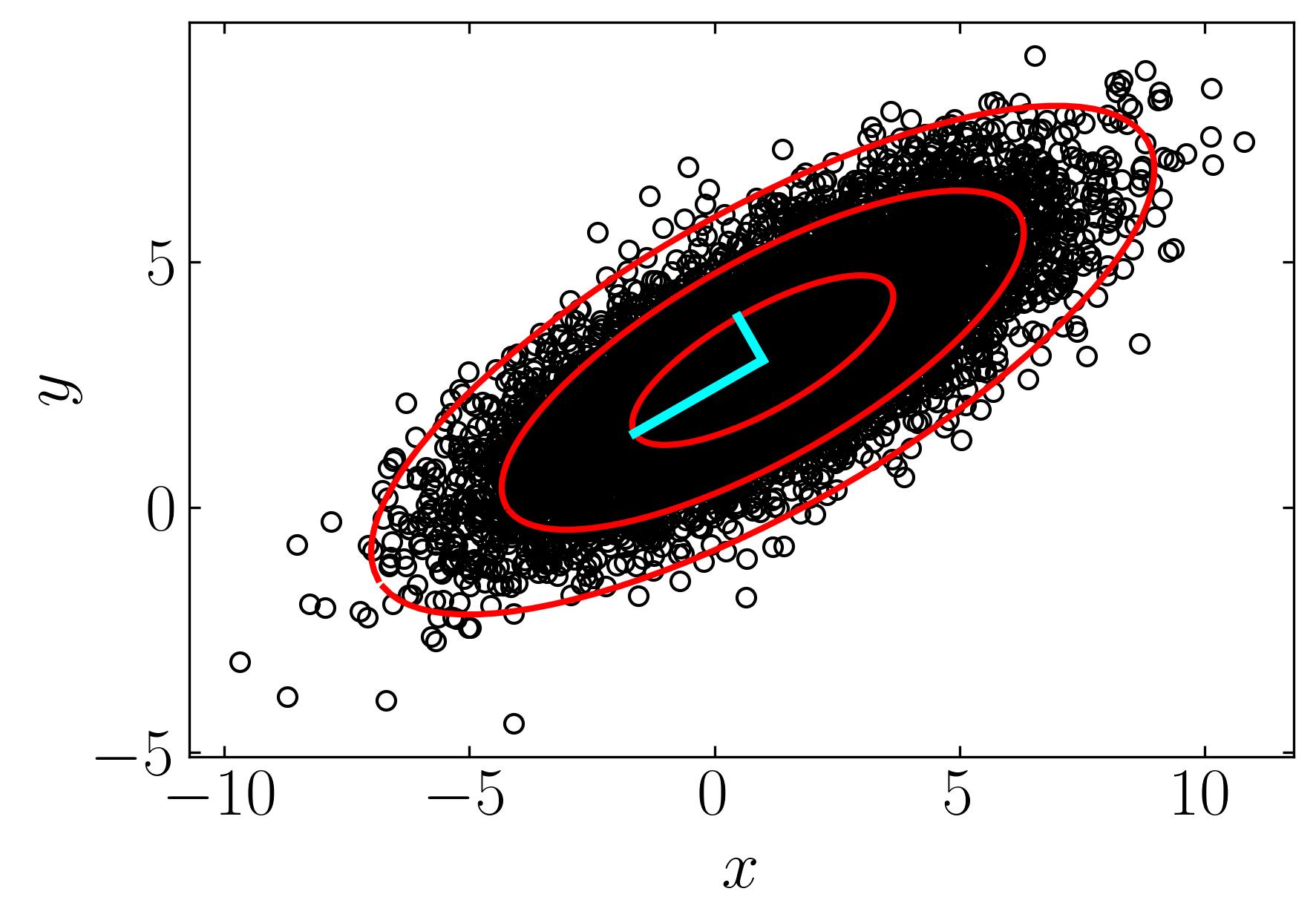
To find the first three confidence intervals, one can multiply the interval by 1, 2, and 3. Additionally, plotting the principal components of this data cloud can be achieved using the left singular matrix (U) and the largest eigenvalues (S). Below is a script to execute these tasks:
fig, ax = plt.subplots()

ax.plot(X[0,:], X[1,:], marker = 'o', ls='', markerfacecolor = 'none', markeredgecolor='k', label = 'Data')

### Plot confidence intervals
ax.plot(Xavg[0] + Xstd[0,:], Xavg[1] + Xstd[1,:],'-',color='r', lw = 2)
ax.plot(Xavg[0] + 2*Xstd[0,:], Xavg[1] + 2*Xstd[1,:],'-',color='r', lw = 2)
ax.plot(Xavg[0] + 3*Xstd[0,:], Xavg[1] + 3*Xstd[1,:],'-',color='r', lw = 2)

# Plot principal components
ax.plot(np.array([Xavg[0], Xavg[0]+U[0,0]*S[0]]),
        np.array([Xavg[1], Xavg[1]+U[1,0]*S[0]]),'-',color='cyan', lw = 3)
ax.plot(np.array([Xavg[0], Xavg[0]+U[0,1]*S[1]]),
        np.array([Xavg[1], Xavg[1]+U[1,1]*S[1]]),'-',color='cyan', lw = 3)

ax.set_xlabel(r'$x$')
ax.set_ylabel(r'$y$')
ax.xaxis.set_tick_params(direction='in', which='both')
ax.yaxis.set_tick_params(direction='in', which='both')
ax.xaxis.set_ticks_position('both')
ax.yaxis.set_ticks_position('both')

ax.set_aspect('equal')

plt.show()
Example : Brest Cancer Data
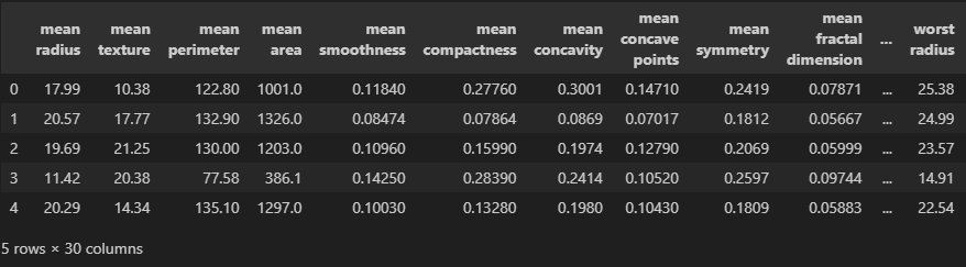
Let’s apply Principal Component Analysis (PCA) to a more complex dataset, such as Scikit-learn’s Breast Cancer Dataset. This dataset comprises breast cancer data from 569 female patients, with each observation containing 30 attributes. The high dimensionality of this dataset presents several challenges. To begin, we’ll confirm the level of correlation within the data by employing Singular Value Decomposition (SVD) and examining the variance captured by the first few modes.
To follow along, fire up a Jupyter notebook and proceed with the following steps. Load the dependencies:
import pandas as pd
import numpy as np
import matplotlib.pyplot as plt
from matplotlib import colors
plt.rcParams.update({'font.size' : 22, 'font.family' : 'Times New Roman', "text.usetex": True})
Load the breast cancer dataset from Scikit-learn:
from sklearn.datasets import load_breast_cancer
cancer = load_breast_cancer()
cancer.keys()
### Output
### dict_keys(['data', 'target', 'frame', 'target_names', 'DESCR', 'feature_names', 'filename', 'data_module'])
Create a Dataframe with this new dataset:
df = pd.DataFrame(cancer['data'],columns=cancer['feature_names'])
df.head()
At this point, apply Singular Value Decomposition (SVD) to assess the level of correlation. The cumulative explained variance ratio plot will help us understand how much variance is captured by the first few principal components.
u, s, vt = LA.svd(df) ### SVD

fig, ax = plt.subplots()

ax.semilogy(s, marker = 'o', markerfacecolor = 'none', markeredgecolor = 'k', ls='-', color = 'k')

ax.set_xlabel(r'$n$')
ax.set_ylabel('Singular Values,' + r'$\sigma_n$')
ax.xaxis.set_tick_params(direction='in', which='both')
ax.yaxis.set_tick_params(direction='in', which='both')
ax.xaxis.set_ticks_position('both')
ax.yaxis.set_ticks_position('both')
plt.show()

cumulative = np.cumsum(s)/np.sum(s)  ### Cumulative spectrum

fig, ax = plt.subplots()

ax.plot(cumulative, marker = 'o', markerfacecolor = 'none', markeredgecolor = 'k', ls='-', color = 'k')

ax.set_xlabel(r'$n$')
ax.set_ylabel(r'$\sum\sigma_n$')
ax.xaxis.set_tick_params(direction='in', which='both')
ax.yaxis.set_tick_params(direction='in', which='both')
ax.xaxis.set_ticks_position('both')
ax.yaxis.set_ticks_position('both')
plt.show()
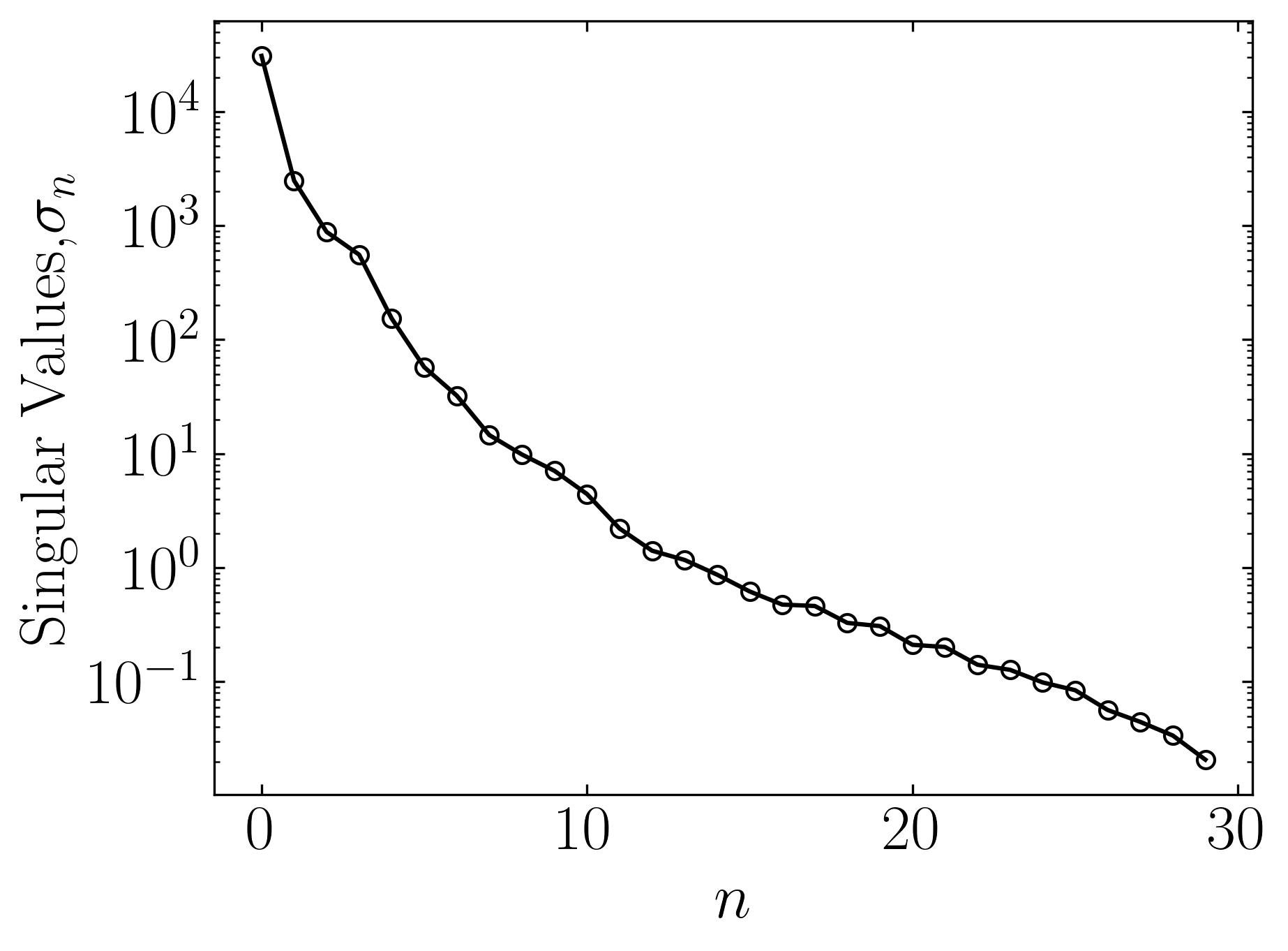
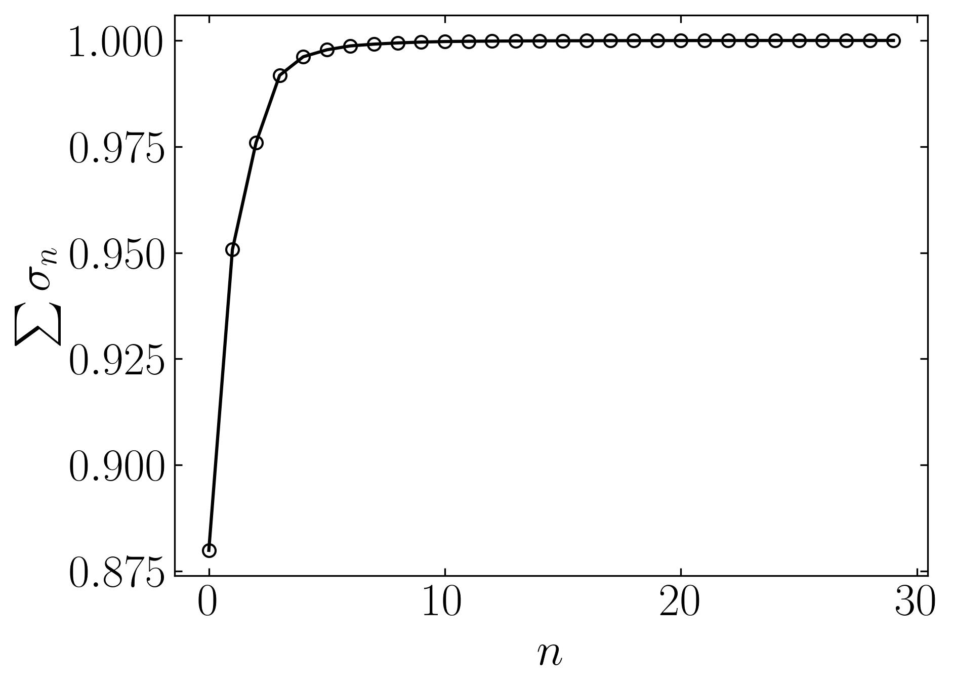
The plots indeed reveal that a significant amount of variance is captured by the first few modes of this data. This observation suggests a high level of correlation among the features of breast cancer patients, indicating substantial overlap in their cancer characteristics. The ability to visualize such patterns and correlations in a high-dimensional dataset underscores the importance of Principal Component Analysis (PCA).
Returning to the Breast Cancer Dataset, with its 30 dimensions, visualizing it directly becomes challenging. Therefore, we’ll employ PCA to extract the first three principal components and visualize them in a 3D space. Let’s conduct this PCA analysis using scikit-learn:
### Scalar fitting step for normalization
from sklearn.preprocessing import StandardScaler
scaler = StandardScaler()
scaler.fit(df)
scaled_data =scaler.transform(df)

### Perform PCA
from sklearn.decomposition import PCA
pca = PCA(n_components=3)
pca.fit(scaled_data)
PCA(n_components=3)

### Dataset with reduced dimensionality
x_pca = pca.transform(scaled_data)
print(scaled_data.shape) ### original data shape
print(x_pca.shape) ### new data shape

### Output
### (569, 30)
### (569, 3)
Plot this data:
fig, ax = plt.subplots(subplot_kw={'projection': '3d'}, constrained_layout=True)

ax.scatter(x_pca[:,0],x_pca[:,1], x_pca[:,2],c=cancer['target'],cmap='prism')

ax.set_xlabel(r'$PC1$', labelpad=10)
ax.set_ylabel(r'$PC2$', labelpad=13)
ax.set_zlabel(r'$PC3$', labelpad=13)

ax.view_init(25,20)
ax.set_box_aspect(None, zoom=0.85)

plt.show()
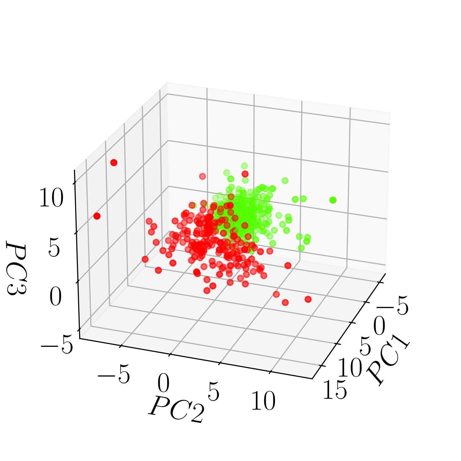
This image displays the Breast Cancer Dataset classified into the two specified targets: benign and malignant. Each point in the 3D space represents a patient, with their attributes projected onto the first three principal components extracted through PCA. The color gradient distinguishes between benign and malignant cases, offering insight into potential clusters and patterns within the dataset.
PCA : Take-aways
Principal Component Analysis (PCA) offers several key takeaways:
- Dimensionality Reduction: PCA enables the reduction of the dimensionality of data while preserving the most critical information. It accomplishes this by transforming the original variables into a new set of uncorrelated variables called principal components.
- Data Visualization: PCA aids in visualizing high-dimensional data by projecting it onto a lower-dimensional subspace while retaining as much variance as possible. This visualization simplifies the interpretation of complex datasets and facilitates exploratory data analysis.
- Feature Extraction: PCA identifies the most significant features in the data by ranking the importance of each principal component. This feature extraction process can help in identifying patterns, trends, and relationships within the dataset.
- Noise Reduction: PCA can mitigate the effects of noise and redundant information present in the data by focusing on the principal components with the highest variance. This leads to a more efficient representation of the data, which can improve the performance of subsequent analysis or modeling tasks.
- Multicollinearity Handling: PCA addresses multicollinearity issues by transforming correlated variables into a new set of orthogonal variables. This transformation reduces the redundancy among variables, which can enhance the stability and accuracy of statistical models.
In summary, PCA provides a powerful framework for reducing the dimensionality of data, visualizing complex datasets, extracting essential features, handling multicollinearity, and enhancing the interpretability and efficiency of various data analysis tasks.
Enjoy Reading This Article?
Here are some more articles you might like to read next: